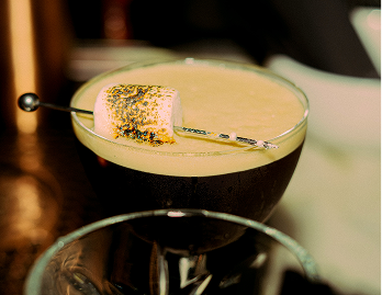
Just stop in front of a gin shelf and you'll see it. Ubiquitous matte black, condensed typefaces, discreet gold foil, the vocabulary of the artisan. Everyone tells the same story — and no one can be heard any more.
The reassuring codes
Craft has its uniforms. Black and gold to signal premium. Condensed serifs to evoke heritage. Botanical illustrations to anchor in nature. These codes didn't appear by chance: they emerged from a few resounding successes, quickly copied, until they became the unspoken norm of an entire sector.
Brands adopt them for understandable reasons. First, to reduce risk. When a distributor or a supermarket buyer instantly recognises the category's visual signals, the sale is easier. Moving away from these codes means risking being put in the wrong box — literally and figuratively. Competitive benchmarking does the rest: you commission a market study, pin up the leaders, and fall into line.
The problem isn't the approach. It's its systematic outcome. When everyone aligns with the same references, the market turns into a mirror. And in a mirror, you only see what you're already looking for — never what surprises.
When benchmarking becomes a trap
Competitive analysis is a valuable tool. Misused, it becomes the engine of convergence. The brief "I want something like them, but better" is the beginning of invisibility. "Better" isn't enough when consumers perceive the category first, and the brand only second.
This mechanism is well documented in packaging design: challengers who borrow the leader's codes end up strengthening the leader's recall, not their own. You have invested in a label that subtly reminds your customer that your competitor exists.
"Drawing inspiration from what already exists guarantees you'll arrive late in a market already saturated with those same codes."
The question isn't whether your competitors did good work. The question is whether their territory is yours. In most cases, it isn't — but the brief never asked that clearly.
What your label should be saying
The brands that stand out aren't trying to be different. They're trying to be true. Distinction comes naturally when you start from what is real, singular and impossible to reproduce: the land, the method, the founder, the seasons. That's where identity lies — not in a bolder colour palette or a more original illustration.
Before briefing a studio or an agency, you need to be able to answer these questions:
- Which detail of your process are you obsessed with?
- Which season, which light, which sound embodies your product?
- If your label had to sum up your biography in a single image — which one would it be?
These questions seem simple. They are rarely asked. Yet their answers are what make it possible to build a visual territory no competitor can copy, because it fundamentally belongs to you.
The perfect label isn't the one that looks impressive in photos. It's the one you'd recognise among a thousand, that you're happy to find again, and that says something true about what's in the bottle. Everything else is just noise.